 我的工具
我的工具 我的开源
我的开源css 学习
感觉自己css很烂,学习下,目标写出漂亮的界面
资料
尚硅谷css3:https://www.bilibili.com/video/BV1XJ411X7Ud
MDN:https://developer.mozilla.org/zh-CN/
CSS3参考手册:http://caibaojian.com/
HTML
转义字符
在HTML中有些时候,我们不能直接书写一些特殊符号
比如:多个连续的空格,比如字母两侧的大于和小于号
  空格
> 大于号
< 小于号
© 版权符号
mete标签
charset指定网页的字符集name指定的数据的名称content指定的数据的内容keywords表示网站的关键字,可以同时指定多个关键字,关键字间使用,隔开
<meta name="Keywords" content="网上购物,网上商城,手机,笔记本,电脑,MP3,CD,VCD,DV,相机,数码,配件,手表,存储卡,京东"/>
description用于指定网站的描述
<meta name="description" content="京东JD.COM-专业的综合网上购物商城,销售家电、数码通讯、电脑、家居百货、服装服饰、母婴、图书、食品等数万个品牌优质商品.便捷、诚信的服务,为您提供愉悦的网上购物体验!"/>
                    网站的描述会显示在搜索引擎的搜索的结果中
title标签的内容会作为搜索结果的超链接上的文字显示
元素类型
块元素(block element)
-
在网页中一般通过块元素来对页面进行布局
行内元素(inline element) -
行内元素主要用来包裹文字
-
一般情况下会在块元素中放行内元素,而不会在行内元素中放块元素
-
块元素中基本上什么都能放
-
p元素中不能放任何的块元素
css引入方式
- 链接式
<link href="../css/main.css" />
- 行内样式
<div style="height: 200px;">2333</div>
- 内联式
<style>
			div{
				border: aqua solid 2px;
			}
		</style>
选择器
MDN官方文档:https://developer.mozilla.org/zh-CN/docs/Learn/CSS/First_steps/How_CSS_is_structured
基础选择器
元素选择器
			div{
				border: aqua solid 2px;
			}
类选择器
			.demo01{
				border: aqua solid 0.3125rem;
			}
ID选择器
			#demo01{
				border: aqua solid 0.3125rem;
			}
属性选择器
官方文档https://developer.mozilla.org/en-US/docs/Web/CSS/Attribute_selectors
   			/* 选择有type属性的元素 */
			[type] {
				color: #00FFFF;
			}
			/* 选择type属性是hello的元素 */
			[type="hello"] {

				color: cornflowerblue;
			}
			/* 选择title属性包含hello的元素 */
			[title*="hello"] {
				color: cornflowerblue;
			}
			/* 选择title属性是hello开头的元素 */
			[title^="hello"] {
				color: cornflowerblue;
			}
			/* 选择title属性是hello结尾的元素 */
			[title$="hello"] {
				color: cornflowerblue;
			}
通配选择器选择所有元素
*{
				color: #00FFFF;
}
交集选择器
选中既是div又class为red的元素
div.red{
				color: royalblue;
}
- 交集选择器如果有元素选择器,必须元素选择器在开头
并集选择器
作用:同时选择多个选择器对应的元素
语法:选择器1,选择器2,选择器3,选择器n{}
span,a{
				color: skyblue;
			}
关系选择器
- 父元素
- 直接包含子元素的元素叫做父元素
- 子元素
- 直接被父元素包含的元素是子元素
- 祖先元素
- 直接或间接包含后代元素的元素叫做祖先元素
- 一个元素的父元素也是它的祖先元素、
- 后代元素
- 直接或间接被祖先元素包含的元素叫做后代元素
- 子元素也是后代元素
- 兄弟元素
- 拥有相同父元素的元素是兄弟元素
<body>
		<div>我是div
			<p>
				我是p元素
				<span>我是p元素中span元素</span>
			</p>
			<span>我是span元素</span>
		</div>
	</body>
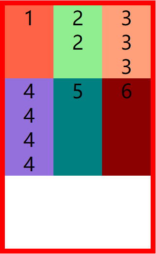
子元素选择器
直接被父元素包含的元素是子元素
选择div中span子元素
div > span {
				color: slateblue;
			}
后代元素选择器
直接或间接被祖先元素包含的元素叫做后代元素
子元素也是后代元素
div span{
				color: steelblue;
			}

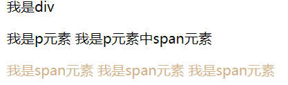
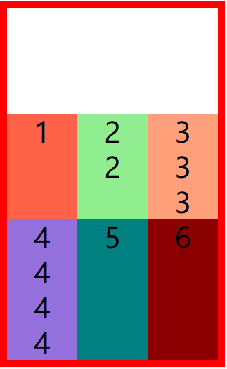
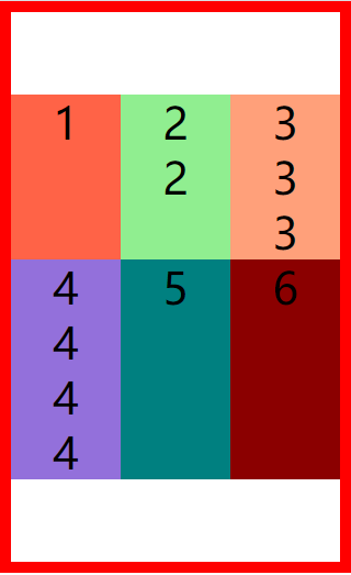
兄弟选择器
拥有相同父元素的元素是兄弟元素
选择下一个兄弟
<body>
		<div>我是div
			<p>
				我是p元素
				<span>我是p元素中span元素</span>
			</p>
			<span>我是span元素</span>
			<span>我是span元素</span>
			<span>我是span元素</span>
		</div>
	</body>
p + span{
				color: tan;
			}
选择所有兄弟
p ~ span{
				color: tan;
			}
伪类选择器
https://developer.mozilla.org/en-US/docs/Web/CSS/Pseudo-classes
伪类(不存在的类,特殊的类)
        - 伪类用来描述一个元素的特殊状态
            比如:第一个子元素、被点击的元素、鼠标移入的元素...

                        - 伪类一般情况下都是使用`:`开头
            `:first-child` 第一个子元素
            `:last-child` 最后一个子元素
            `:nth-child()` 选中第n个子元素
                    特殊值:
                            n 第n个 n的范围0到正无穷
                            2n 或 `even 表示选中偶数`位的元素
            2n+1 或 `odd 表示选中奇数`位的元素
                - 以上这些伪类都是根据所有的子元素进行排序

            `:first-of-type` 选择器匹配元素其父级是特定类型的第一个子元素
            `:last-of-type`选择器匹配元素其父级是特定类型的最后一个子元素。
            `:nth-of-type()`选择器匹配元素其父级是特定类型的第n个子元素。

            - 这几个伪类的功能和上述的类似,不通点是他们是在同类型元素中进行排序

                        - :not() 否定伪类

            - 将符合条件的元素从选择器中去除


                 `:link` 用来表示没访问过的链接(正常的链接)
 a:link{
            color: red;

        }
:visited 用来表示访问过的链接
由于隐私的原因,所以visited这个伪类只能修改链接的颜色
 a:visited{
            color: orange;
            /* font-size: 50px;   */
        }
:hover 用来表示鼠标移入的状态
a:hover{
             color: aqua;
             font-size: 50px;
         }
:active 用来表示鼠标点击
  a:active{
             color: yellowgreen;

         }
伪元素选择器
https://developer.mozilla.org/en-US/docs/Web/CSS/Pseudo-elements
/*
伪元素,表示页面中一些特殊的并不真实的存在的元素(特殊的位置)
伪元素使用 :: 开头
::first-letter 表示第一个字母
                ::first-line 表示第一行
                ::selection 表示选中的内容
                ::before 元素的开始
                ::after 元素的最后
                - before 和 after 必须结合content属性来使用
            */
             选择第一个字母


    ```
  p::first-letter{
                font-size: 50px;
                }
    ```

    	选择第一行


```
     p::first-line{
                    background-color: yellow;
                }
    ```

    	选中内容的样式


    ```
       p::selection{
                background-color: greenyellow;
            }
    ```

    	元素的开始

    ```
    div::before{
                content: 'abc';
                color: red;
            }
    ```

    	元素的最后

    ```
     div::after{
                content: 'haha';
                color: blue;
            }
    ```
选择器权重
样式的冲突
- 当我们通过不同的选择器,选中相同的元素,并且为相同的样式设置不同的值时,此时就发生了样式的冲突。
发生样式冲突时,应用哪个样式由选择器的权重(优先级)决定
选择器的权重
                内联样式        1,0,0,0
                id选择器        0,1,0,0
                类和伪类选择器   0,0,1,0
                元素选择器       0,0,0,1
                通配选择器       0,0,0,0
                继承的样式       没有优先级
比较优先级时,需要将所有的选择器的优先级进行相加计算,最后优先级越高,则越优先显示(分组选择器是单独计算的),
                选择器的累加不会超过其最大的数量级,类选择器在高也不会超过id选择器
                如果优先级计算后相同,此时则优先使用靠下的样式
可以在某一个样式的后边添加 !important ,则此时该样式会获取到最高的优先级,甚至超过内联样式,
                注意:在开发中这个玩意一定要慎用!
练习
选择器在线游戏:http://m.zhaojishun.cn/cssgame/
样式的继承
样式的继承,我们
为一个元素设置的样式同时也会应用到它的后代元素上
继承是发生在祖先后后代之间的
继承的设计是为了方便我们的开发,
                利用继承我们可以将一些通用的样式统一设置到共同的祖先元素上,
                    这样只需设置一次即可让所有的元素都具有该样式
注意:并不是所有的样式都会被继承:
                比如 背景相关的,布局相关等的这些样式都不会被继承。
<body>
    <p>
        我是一个p元素
        <span>我是p元素中的span</span>
    </p>

    <span>我是p元素外的span</span>

    <div>
        我是div
        <span>
            我是div中的span
            <em>我是span中的em</em>
        </span>
    </div>
</body>
 p{
            color: red;
            background-color: orange;
        }

        div{
            color: yellowgreen
        }
单位
长度
像素
像素
                        - 屏幕(显示器)实际上是由一个一个的小点点构成的
                        - 不同屏幕的像素大小是不同的,像素越小的屏幕显示的效果越清晰
                        - 所以同样的200px在不同的设备下显示效果不一样
百分比
百分比
                        - 也可以将属性值设置为相对于其父元素属性的百分比
                        - 设置百分比可以使子元素跟随父元素的改变而改变
em
em
                        - em是相对于元素的字体大小来计算的
                        - 1em = 1font-size
                        - em会根据字体大小的改变而改变
rem
rem
                        - rem是相对于根元素的字体大小来计算
颜色
/*
                颜色单位:
                    在CSS中可以直接使用颜色名来设置各种颜色
                        比如:red、orange、yellow、blue、green ... ...
                        但是在css中直接使用颜色名是非常的不方便

                    RGB值:
                        - RGB通过三种颜色的不同浓度来调配出不同的颜色
                        - R red,G green ,B blue
                        - 每一种颜色的范围在 0 - 255 (0% - 100%) 之间
                        - 语法:RGB(红色,绿色,蓝色)

                    RGBA:
                        - 就是在rgb的基础上增加了一个a表示不透明度
                        - 需要四个值,前三个和rgb一样,第四个表示不透明度
                            1表示完全不透明   0表示完全透明  .5半透明

                    十六进制的RGB值:
                        - 语法:#红色绿色蓝色
                        - 颜色浓度通过 00-ff
                        - 如果颜色两位两位重复可以进行简写
                            #aabbcc --> #abc

                    HSL值 HSLA值
                        H 色相(0 - 360)
                        S 饱和度,颜色的浓度 0% - 100%
                        L 亮度,颜色的亮度 0% - 100%

             */
角度
deg
度(Degress)。一个圆共360度
transform:rotate(2deg);
turn
转、圈(Turns)。一个圆共1圈
transform:rotate(.5turn);
文档流
文档流(normal flow)
        - 网页是一个多层的结构,一层摞着一层
                    - 通过CSS可以分别为每一层来设置样式
                    - 作为用户来讲只能看到最顶上一层
                                - 这些层中,最底下的一层称为文档流,文档流是网页的基础(可以理解为ps中的图层)
            我们所创建的元素默认都是在文档流中进行排列
                                - 对于我们来元素主要有两个状态
            在文档流中
            不在文档流中(脱离文档流)
        - 元素在文档流中有什么特点:
        - 块元素
                - 块元素会在页面中独占一行(自上向下垂直排列)
                - 默认宽度是父元素的全部(会把父元素撑满)
                - 默认高度是被内容撑开(子元素)
- 行内元素
- 行内元素不会独占页面的一行,只占自身的大小
- 行内元素在页面中左向右水平排列,如果一行之中不能容纳下所有的行内元素
则元素会换到第二行继续自左向右排列(书写习惯一致) - 行内元素的默认宽度和高度都是被内容撑开
-->
元素脱离文档流后特点
元素设置浮动以后,将会从文档流中脱离,从文档流中脱离后,元素的一些特点也会发生变化
- 块元素:
- 块元素不在独占页面的一行
- 脱离文档流以后,块元素的宽度和高度默认都被内容撑开
- 行内元素:
- 行内元素脱离文档流以后会变成块元素,特点和块元素一样
- 脱离文档流以后,不需要再区分块和行内了
盒子模型
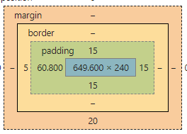
盒模型、盒子模型、框模型(box model)
- CSS将页面中的所有元素都设置为了一个矩形的盒子
- 将元素设置为矩形的盒子后,对页面的布局就变成将不同的盒子摆放到不同的位置
- 每一个盒子都由一下几个部分组成:
内容区(content)
内边距(padding)
边框(border)
外边距(margin)
content内容区
内容区(content),元素中的所有的子元素和文本内容都在内容区中排列
内容区的大小由width 和 height两个属性来设置,行内元素无法设置宽高,其大小被内容撑开
width 设置内容区的宽度
height 设置内容区的高度
border 边框
边框
边框的宽度 border-width
边框的颜色 border-color
边框的样式 border-style
border-width: 10px;
默认值,一般都是 3个像素
border-width可以用来指定四个方向的边框的宽度
值的情况
四个值:上 右 下 左
三个值:上 左右 下
两个值:上下 左右
一个值:上下左右
除了border-width还有一组 border-xxx-width
                    xxx可以是 top right bottom left
                    用来
单独指定某一个边的宽度
border-width: 10px;
border-top-width: 10px;
border-left-width: 30px;
color: red;
border-color用来指定边框的颜色,同样可以分别指定四个边的边框
                    规则和border-width一样
border-color也可以省略不写,如果省略了则自动使用color的颜色值
border-color: orange red yellow green;
             border-color: orange;
border-style 指定边框的样式
                    solid 表示实线
                    dotted 点状虚线
                    dashed 虚线
                    double 双线
border-style的默认值是none 表示没有边框
border-style: solid dotted dashed double;
             border-style: solid;

             border-width: 10px;
             border-color: orange;
             border-style: solid;
/*
                border简写属性,通过该属性可以同时设置边框所有的相关样式,并且没有顺序要求
除了border以外还有四个 border-xxx
                    border-top
                    border-right
                    border-bottom
                    border-left
 border: solid 10px orange;
              border-top: 10px solid red;
              border-left: 10px solid red;
              border-bottom: 10px solid red;

              border: 10px red solid;
              border-right: none;
padding内边距
内容区和边框之间的距离是内边距
一共有四个方向的内边距:
内边距的设置会影响到盒子的大小
背景颜色会延伸到内边距上一共盒子的可见框的大小,由内容区 内边距 和 边框共同决定,
所以在计算盒子大小时,需要将这三个区域加到一起计算
padding-top: 100px;
             padding-left: 100px;
             padding-right: 100px;
             padding-bottom: 100px;
padding 内边距的简写属性,可以同时指定四个方向的内边距,规则和border-width 一样
 padding: 10px 20px 30px 40px;
              padding: 10px 20px 30px ;
              padding: 10px 20px ;
              padding: 10px ;
margin外边距
- 外边距不会影响盒子可见框的大小
- 但是外边距会影响盒子的位置
- 一共有四个方向的外边距:
margin-top上外边距,设置一个正值,元素会向下移动margin-right默认情况下设置margin-right不会产生任何效果margin-bottom下外边距,设置一个正值,其下边的元素会向下移动margin-left左外边距,设置一个正值,元素会向右移动
- margin也可以设置负值,如果是负值则元素会向相反的方向移动
- 元素在页面中是按照自左向右的顺序排列的,所以默认情况下如果我们
设置的左和上外边距会移动元素自身
而设置下和右外边距会移动其他元素
margin的简写属性
margin 可以同时设置四个方向的外边距 ,用法和padding一样
margin会影响到盒子实际占用空间
/* margin-top: 100px;
             margin-left: 100px;
             margin-bottom: 100px; */

             /* margin-bottom: 100px; */
             /* margin-top: -100px; */
             /* margin-left: -100px; */
             /* margin-bottom: -100px; */

             /* margin-right: 0px; */

             margin: 100px;
块元素的盒子模型
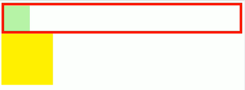
盒子的水平布局
.outer{
            width: 800px;
            height: 200px;
            border: 10px red solid;
        }

        .inner{
            /* width: auto;  width的值默认就是auto*/
            width: 200px;
            height: 200px;
            background-color: #bfa;
            margin-right: auto;
            margin-left: auto;
            /* margin-left: 100px;
            margin-right: 400px */
            /*
                元素的水平方向的布局:
                    元素在其父元素中水平方向的位置由以下几个属性共同决定“
                        margin-left
                        border-left
                        padding-left
                        width
                        padding-right
                        border-right
                        margin-right

                    一个元素在其父元素中,水平布局必须要满足以下的等式
margin-left+border-left+padding-left+width+padding-right+border-right+margin-right = 其父元素内容区的宽度 (必须满足)

                0 + 0 + 0 + 200 + 0 + 0 + 0 = 800
                0 + 0 + 0 + 200 + 0 + 0 + 600 = 800


                100 + 0 + 0 + 200 + 0 + 0 + 400 = 800
                100 + 0 + 0 + 200 + 0 + 0 + 500 = 800
                    - 以上等式必须满足,如果相加结果使等式不成立,则称为过度约束,则等式会自动调整
                        - 调整的情况:
                            - 如果这七个值中没有为 auto 的情况,则浏览器会自动调整margin-right值以使等式满足
                    - 这七个值中有三个值和设置为auto
                        width
                        margin-left
                        maring-right
                        - 如果某个值为auto,则会自动调整为auto的那个值以使等式成立
                            0 + 0 + 0 + auto + 0 + 0 + 0 = 800  auto = 800
                            0 + 0 + 0 + auto + 0 + 0 + 200 = 800  auto = 600
                            200 + 0 + 0 + auto + 0 + 0 + 200 = 800  auto = 400

                            auto + 0 + 0 + 200 + 0 + 0 + 200 = 800  auto = 400


                            auto + 0 + 0 + 200 + 0 + 0 + auto = 800  auto = 300

                        - 如果将一个宽度和一个外边距设置为auto,则宽度会调整到最大,设置为auto的外边距会自动为0
                        - 如果将三个值都设置为auto,则外边距都是0,宽度最大
                        - 如果将两个外边距设置为auto,宽度固定值,则会将外边距设置为相同的值
                            所以我们经常利用这个特点来使一个元素在其父元素中水平居中
                            示例:
                                width:xxxpx;
                                margin:0 auto;
             */
        }
盒子的垂直布局
.outer{
            background-color: #bfa;
            height: 600px;
            /*
                默认情况下父元素的高度被内容撑开
             */
        }

        .inner{
            width: 100px;
            background-color: yellow;
            height: 100px;
            margin-bottom: 100px;

        }

        .box1{
            width: 200px;
            height: 200px;
            background-color: #bfa;
            /*
                子元素是在父元素的内容区中排列的,
                    如果子元素的大小超过了父元素,则子元素会从父元素中溢出
                    使用 overflow 属性来设置父元素如何处理溢出的子元素

                    可选值:
                        visible,默认值 子元素会从父元素中溢出,在父元素外部的位置显示
                        hidden 溢出内容将会被裁剪不会显示
                        scroll 生成两个滚动条,通过滚动条来查看完整的内容
                        auto 根据需要生成滚动条

                overflow-x:
                overflow-y:
             */
            overflow: auto;


        }

        .box2{
            width: 100px;
            height: 400px;
            background-color: orange;
        }
外边距的折叠
相邻的垂直方向外边距会发生重叠现象
- 兄弟元素
- 兄弟元素间的相邻垂直外边距会取两者之间的较大值(两者都是正值)
- 特殊情况:
- 如果相邻的外边距一正一负,则取两者的和
- 如果相邻的外边距都是负值,则取两者中绝对值较大的
- 兄弟元素之间的外边距的重叠,对于开发是有利的,所以我们不需要进行处理
- 父子元素
- 父子元素间相邻外边距,子元素的会传递给父元素(上外边距)
- 父子外边距的折叠会影响到页面的布局,必须要进行处理
解决方式
.clearfix::before,
        .clearfix::after{
            content: '';
            display: table;
            clear: both;
        }
<div class="box1 clearfix">
        <div class="box2"></div>
    </div>
行内元素的盒子模型
- 行内元素的盒模型
- 行内元素不支持设置宽度和高度
- 行内元素可以设置padding,但是垂直方向padding不会影响页面的布局
- 行内元素可以设置border,垂直方向的border不会影响页面的布局
- 行内元素可以设置margin,垂直方向的margin不会影响布局
display 用来设置元素显示的类型
                    可选值:
                        inline 将元素设置为行内元素
                        block 将元素设置为块元素
                        inline-block 将元素设置为行内块元素
                                行内块,既可以设置宽度和高度又不会独占一行
                        table 将元素设置为一个表格
                        none 元素不在页面中显示

                visibility 用来设置元素的显示状态
                    可选值:
                        visible 默认值,元素在页面中正常显示
                        hidden 元素在页面中隐藏 不显示,但是依然占据页面的位置
盒子的大小 -box-sizing
.box1{
            width: 100px;
            height: 100px;
            background-color: #bfa;
            padding: 10px;
            border: 10px red solid;
            /*
                默认情况下,盒子可见框的大小由内容区、内边距和边框共同决定

                    box-sizing 用来设置盒子尺寸的计算方式(设置width和height的作用)
                        可选值:
                            content-box 默认值,宽度和高度用来设置内容区的大小
                            border-box 宽度和高度用来设置整个盒子可见框的大小
                                width 和 height 指的是内容区 和 内边距 和 边框的总大小
             */

            box-sizing: border-box;
        }
练习
1、京东图片列表
<!DOCTYPE html>
<html lang="en">
<head>
    <meta charset="UTF-8">
    <meta name="viewport" content="width=device-width, initial-scale=1.0">
    <title>Document</title>
    <link rel="stylesheet" href="../static/css/reset.css">
    <style>
        body{
            background-color: silver;
        }
        .content{
            width: 190px;
            height: 470px;
            /* 裁剪溢出内容 */
            overflow: hidden;
            /* 居中 */
            margin: 50px auto;
            background-color: snow;
        }
        .content img{
            width: 100%;
        }
        /* 最后一个元素不需要margin */
        .content > div:not(:last-child) {
            margin-bottom: 9px;
        }

    </style>
</head>
<body>
    <div class="content">
        <div>
            <a href="">
                <img src="../static/img/72d405a1515af33a.jpg.webp" alt="">
            </a>
        </div>
        <div>
            <a href="">
                <img src="../static/img/72d405a1515af33a.jpg.webp" alt="">
            </a>
        </div>
        <div>
            <a href="">
                <img src="../static/img/72d405a1515af33a.jpg.webp" alt="">
            </a>
        </div>

    </div>
</body>
</html>
2、网易新闻列表
<!DOCTYPE html>
<html lang="en">
<head>
    <meta charset="UTF-8">
    <meta name="viewport" content="width=device-width, initial-scale=1.0">
    <title>仿网易新闻列表</title>
    <link rel="stylesheet" href="../static/css/reset.css">
    <style>

        a{
            text-decoration: none;
        }

        body{
            /* background-color: rgb(0, 119, 255); */
        }
        .content{
            width: 300px;
            height: 330px;
            background-color: snow;
            margin: 20px auto;
            border-top: 1px solid #dddddd ;

        }

        .category{
            height: 40px;
            margin-top: -1px;
        }

        .category a{
            display: inline-block;
            border-top: red 1px solid;
        }

        .category h1{
            display: inline-block;
            color: #404040;
            font-weight: bold;
            margin-top: 8px;
        }

        .category h1:hover{
            color: red;
        }

        .img-title{
            height: 150px;
        }

        .img-title h1{
            margin-top: -25px;
            margin-left: 40px;
            color: #fff;
            font-weight: bold;
        }

        .list{
            margin-top: 15px;
        }

        .list li{
            margin-top: 15px;
        }

        .list a{
            color: #666666;
            font-size: 13px;
        }

        .list a::before{
            content: '✦';
            margin-right: 5px;
        }

        .list a:hover{
            color: red;
        }
    </style>
</head>
<body>
    <div class="content">
        <div class="category">
            <a href="">
                <h1>财经</h1>
            </a>
        </div>
        <div class="img-title">
            <a href="">
                <img src="../static/img/c1600f3bj00q9fsxv001yc0009c005uc.webp" alt="">
                <h1>瑞幸资本帝国雪崩倒计时</h1>
            </a>
        </div>
        <ul class="list">
            <li>
                <a href="">清流|泰禾失信调查:或违规隐瞒巨额交易</a>
            </li>
            <li>
                <a href="">"三桶油"齐发声:接受"至暗时刻"的挑战</a>
            </li>
            <li>
                <a href="">蒋凡被除名阿里合伙人 对张大奕无利益输送</a>
            </li>
            <li>
                <a href="">李国庆否认抢当当公章:没有任何撕扯</a>
            </li>
        </ul>
    </div>
</body>
</html>
轮廓&阴影&圆角
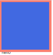
轮廓
outline 用来设置元素的轮廓线,用法和border一模一样,轮廓和边框不同的点,就是轮廓不会影响到可见框的大小
outline: salmon 10px solid;
.box1{
            height: 200px;
            width: 200px;
            background-color: royalblue;
            outline: salmon 10px solid;
        }
<div class="box1">

    </div>
    <span>hello</span>
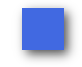
阴影
box-shadow用来设置元素的阴影效果,阴影不会影响页面布局
第一个值 水平偏移量 设置阴影的水平位置 正值向右移动 负值向左移动
第二个值 垂直偏移量 设置阴影的水平位置 正值向下移动 负值向上移动
第三个值 阴影的模糊半径
第四个值 阴影的颜色
box-shadow: 20px 20px 50px rgba(0, 0, 0, .7);
.box1{
            height: 200px;
            width: 200px;
            background-color: royalblue;
            margin: 50px auto;
            box-shadow: 20px 20px 50px rgba(0, 0, 0, .7);
        }
<div class="box1"></div>
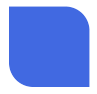
圆角
border-radius: 用来设置圆角 圆角设置的圆的半径大小
border-top-left-radius:
border-top-right-radius
border-bottom-left-radius:
border-bottom-right-radius:
border-top-left-radius:50px 100px;
border-radius可以分别指定四个角的圆角
四个值 左上 右上 右下 左下
三个值 左上 右上/左下 右下
两个个值 左上/右下 右上/左下
border-radius: 50%;将元素设置为一个圆形
border-radius: 0px 60px 0px 60px;
.box1{
            height: 200px;
            width: 200px;
            background-color: royalblue;
            margin: 50px auto;
            border-radius: 0px 60px 0px 60px;
        }
<div class="box1"></div>
布局
float(浮动)
简介
通过浮动可以使一个元素向其父元素的左侧或右侧移动
使用 float 属性来设置于元素的浮动
可选值:
- none 默认值 ,元素不浮动
- left 元素向左浮动
- right 元素向右浮动
注意,
元素设置浮动以后,水平布局的等式便不需要强制成立
元素设置浮动以后,会完全从文档流中脱离,不再占用文档流的位置,
所以元素下边的还在文档流中的元素会自动向上移动
特点
- 浮动元素会完全脱离文档流,不再占据文档流中的位置
- 设置浮动以后元素会向父元素的左侧或右侧移动,
- 浮动元素默认不会从父元素中移出
- 浮动元素向左或向右移动时,不会超过它前边的其他浮动元素
- 如果浮动元素的上边是一个没有浮动的块元素,则浮动元素无法上移
- 浮动元素不会超过它上边的浮动的兄弟元素,最多最多就是和它一样高
- 浮动元素不会盖住文字,文字会自动环绕在浮动元素的周围,所以我们可以利用浮动来设置文字环绕图片的效果
简单总结
浮动目前来讲它的主要作用就是让页面中的元素可以水平排列, 通过浮动可以制作一些水平方向的布局
脱离文档流后特点
高度塌陷问题
效果 :我们希望父元素的大小被子元素的内容撑开,父元素随着子元素大小的改变而改变
在浮动布局中,父元素的高度默认是被子元素撑开的,
当子元素浮动后,其会完全脱离文档流,子元素从文档流中脱离
将会无法撑起父元素的高度,导致父元素的高度丢失父元素高度丢失以后,其下的元素会自动上移,导致页面的布局混乱
所以高度塌陷是浮动布局中比较常见的一个问题,这个问题我们必须要进行处理!
 <div class="outer">

        <div class="inner"></div>

    </div>

    <div style="width: 200px;height: 200px;background-color:yellow;"></div>
.outer{
            border: 10px red solid;
        }

        .inner{
            width: 100px;
            height: 100px;
            background-color: #bfa;
            float: left;
        }
结果效果
BFC解决方式
官方文档:https://developer.mozilla.org/zh-CN/docs/Web/Guide/CSS/Block_formatting_context
BFC(Block Formatting Context) 块级格式化环境
- BFC是一个CSS中的一个隐含的属性,可以为一个元素开启BFC
开启BFC该元素会变成一个独立的布局区域 - 元素开启BFC后的特点:
1.开启BFC的元素不会被浮动元素所覆盖
2.开启BFC的元素子元素和父元素外边距不会重叠
3.开启BFC的元素可以包含浮动的子元素
            - 可以通过一些特殊方式来开启元素的BFC:
                1、设置元素的浮动(不推荐)
                2、将元素设置为行内块元素(不推荐)
                3、将元素的overflow设置为一个非visible的值
                    - 常用的方式 为元素设置 **overflow:hidden** 开启其BFC 以使其可以包含浮动元素
		.outer{
            border: 10px red solid;
             overflow: hidden;
        }
        .inner{
            width: 100px;
            height: 100px;
            background-color: #bfa;
            float: left;
        }
<div class="outer">

        <div class="inner"></div>

    </div>

    <div style="width: 200px;height: 200px;background-color:yellow;"></div>
效果
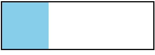
clear解决方式
使用clear和::after实现父元素的大小被子元素的内容撑开,父元素随着子元素大小的改变而改变
.box1{
            border: 5px solid #000000;
        }
        .box2{
            height: 200px;
            width: 200px;
            background-color: skyblue;
            float: left;
        }
        .box1::after{
            content: '';
            display: block;
            clear: both;
        }
<div class="box1">
        <div class="box2"></div>
    </div>
clear
如果我们不希望某个元素因为其他元素浮动的影响而改变位置,
可以通过clear属性来清除浮动元素对当前元素所产生的影响
clear
- 作用:清除浮动元素对当前元素所产生的影响
- 可选值: - left 清除左侧浮动元素对当前元素的影响
- right 清除右侧浮动元素对当前元素的影响
- both 清除两侧中最大影响的那侧
原理:
                    设置清除浮动以后,浏览器会自动为元素添加一个上外边距,
                        以使其位置不受其他元素的影响
练习
仿w3c导航条

<!DOCTYPE html>
<html lang="en">
<head>
    <meta charset="UTF-8">
    <meta name="viewport" content="width=device-width, initial-scale=1.0">
    <title>Document</title>
    <link rel="stylesheet" href="../../../static/css/reset.css">
    <style>
        ul{
            width: 1510px;
            height: 48px;
            margin: 50px auto;
        }
        ul li{
            float: left;
            width: auto;
            height: 100%;
            line-height: 35px;
            background-color: rgb(233, 231, 231);
            color: rgb(168, 167, 167);
            /* font-weight: bold; */
            font-size: 25px;
            padding: 15px 35px 0px 35px;
        }
        ul li:hover{
            background-color: #000000;
            color: rgb(233, 231, 231);
        }

    </style>
</head>
<body>
    <ul>
        <li>HTML/CSS</li>
        <li>Bowser Side</li>
        <li>Server Side</li>
        <li>Programming</li>
        <li>XML</li>
        <li>WebBuilding</li>
        <li>Rederence</li>
    </ul>
</body>
</html>
flex弹性盒子
-
是CSS中的又一种布局手段,它主要用来代替浮动来完成页面的布局
- flex可以使元素具有弹性,让元素可以跟随页面的大小的改变而改变
- 弹性容器
- 要使用弹性盒,必须先将一个元素设置为弹性容器
- 我们通过 display 来设置弹性容器
display:flex设置为块级弹性容器
display:inline-flex设置为行内的弹性容器
     - 弹性元素
         - 弹性容器的子元素是弹性元素(弹性项)
         - **弹性元素可以同时是弹性容器**
弹性容器
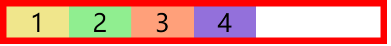
flex-direction 指定容器中弹性元素的排列方式
row默认值,弹性元素在容器中水平排列(左向右)主轴 自左向右row-reverse弹性元素在容器中反向水平排列(右向左)主轴 自右向左column弹性元素纵向排列 。主轴 自上向下column-reverse弹性元素方向纵向排列。主轴自下向上
主轴:
弹性元素的排列方向称为主轴
侧轴:
与主轴垂直方向的称为侧轴
四种排列方式


flex-direction: row;
flex-wrap设置弹性元素是否在弹性容器中自动换行
设置弹性元素是否在弹性容器中自动换行,当弹性容器一行容纳不下子元素时,子元素会不会换到第二行.
- nowrap 默认值,元素不会自动换行
- wrap 元素沿着辅轴方向自动换行
- wrap-reverse 元素沿着辅轴反方向换行
flex-wrap: nowrap;
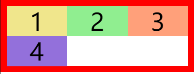
flex-wrap: wrap;
flex-wrap: wrap-reverse;
flex-flow简写属性
wrap 和 direction 的简写属性 方向 换行
flex-flow: row wrap;
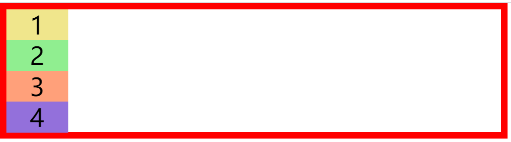
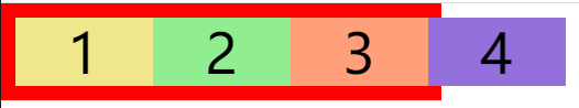
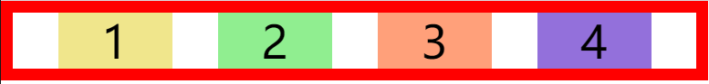
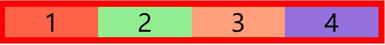
justify-content``主轴上的空白空间的分布
- flex-start 元素沿着主轴起边排列
- flex-end 元素沿着主轴终边排列
- center 元素居中排列
- space-around 空白分布到元素两侧
- space-between 空白均匀分布到元素间
- space-evenly 空白分布到元素的单侧(兼容性不好,不推荐使用)
justify-content: flex-start;
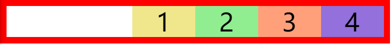
justify-content: flex-end;

justify-content: center;
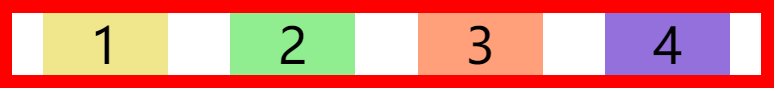
justify-content: space-around;
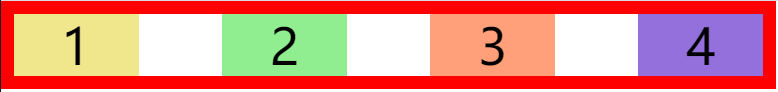
justify-content: space-between;
justify-content: space-evenly;
测试代码
<!DOCTYPE html>
<html lang="en">
<head>
<meta charset="UTF-8">
<meta name="viewport" content="width=device-width, initial-scale=1.0">
<title>Document</title>
<style>
*{
margin: 0;
padding: 0;
list-style: none;
}
ul{
width: 600px;
border: 10px solid red;
display: flex;
justify-content: space-evenly;
}
li{
width: 100px;
height: 50px;
background-color: khaki;
text-align: center;
line-height: 50px;
font-size: 40px;
flex-shrink: 0;
}
.box2{
background-color: lightgreen;
}
.box3{
background-color: lightsalmon;
}
.box4{
background-color:mediumpurple;
}
</style>
</head>
<body>
<ul>
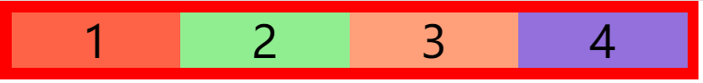
<li class="box1">1</li>
<li class="box2">2</li>
<li class="box3">3</li>
<li class="box4">4</li>
</ul>
</body>
</html>
align-items元素在 辅轴上如何对齐
- stretch 默认值,将元素的长度设置为相同的值
- flex-start 元素不会拉伸,沿着辅轴起边对齐
- flex-end 沿着辅轴的终边对齐
- center 居中对齐
- baseline 基线对齐
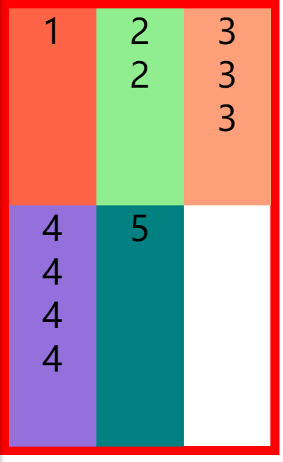
align-items: stretch;
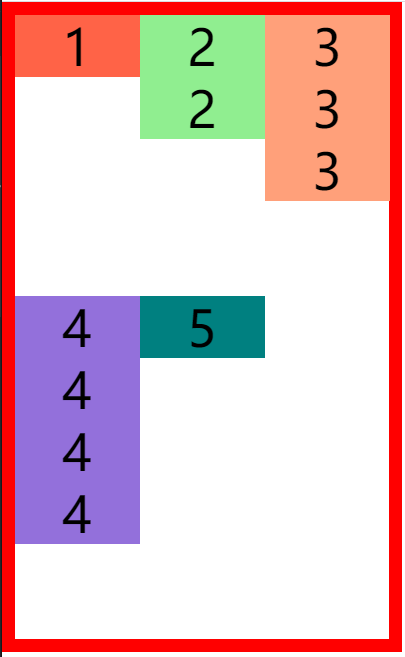
align-items: flex-start;
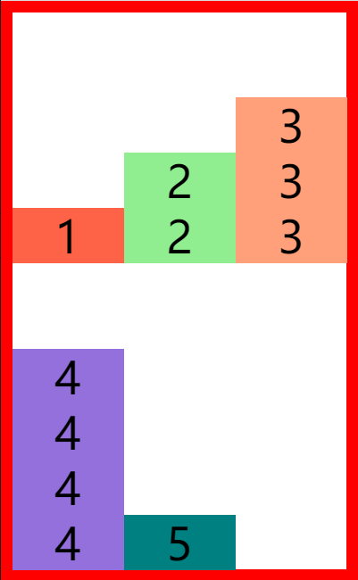
align-items: flex-end;
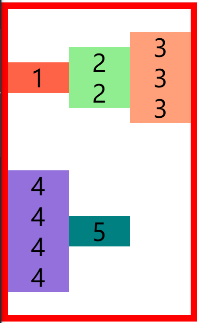
align-items: center;
测试代码
<!DOCTYPE html>
<html lang="en">
<head>
    <meta charset="UTF-8">
    <meta name="viewport" content="width=device-width, initial-scale=1.0">
    <title>Document</title>
    <style>
        *{
            margin: 0;
            padding: 0;
            list-style: none;
        }
        ul{
            width: 300px;
            height: 500px;
            border: 10px solid red;
            display: flex;
            flex-flow: wrap row;
            /* justify-content: space-evenly; */
            align-items: center;
        }

        li{
            width: 100px;
            /* height: 50px; */
            /* background-color: khaki; */
            text-align: center;
            line-height: 50px;
            font-size: 40px;
            flex-shrink: 0;
        }

        .box1{
            background-color:tomato;
        }

        .box2{
            background-color: lightgreen;
        }

        .box3{

            background-color: lightsalmon;
        }
        .box4{
        background-color:mediumpurple;
        }
        .box5{
            background-color:teal;
        }

    </style>
</head>
<body>
    <ul>
        <li class="box1">1</li>
        <li class="box2">2
            <div>2</div>
        </li>
        <li class="box3">3
            <div>3</div>
            <div>3</div>
        </li>
        <li class="box4">4
            <div>4</div>
            <div>4</div>
            <div>4</div>
        </li>
        <li class="box5">5</li>
    </ul>
</body>
</html>
align-content:辅轴空白空间的分布
类似
justify-content
- flex-start 元素沿着辅轴起边排列
- flex-end 元素沿着辅轴终边排列
- center 元素居中排列
- space-around 空白分布到元素两侧
- space-between 空白均匀分布到元素间
- space-evenly 空白分布到元素的单侧(兼容性不好,不推荐使用)
align-content: flex-start;
align-content: flex-end;
align-content: center;
align-content: space-around;
align-content: space-between;
垂直水平居中
align-items: center;
justify-content: center;
弹性元素
flex-grow 指定弹性元素的伸展的系数
- 当父元素有多余空间的时,子元素如何伸展
- 父元素的剩余空间,会按照比例进行分配,数值越高,权重越高。0表示不伸展
flex-grow: 1;
flex-shrink 指定弹性元素的收缩系数
- 当父元素中的空间不足以容纳所有的子元素时,如何对子元素进行收缩,数值越高,权重越高,0表示不收缩
flex-shrink: 1;
flex-basis 指定的是元素在主轴上的基础长度
- 如果主轴是 横向的 则 该值指定的就是元素的宽度
- 如果主轴是 纵向的 则 该值指定的是就是元素的高度
- 默认值是 auto,表示参考元素自身的高度或宽度
- 如果传递了一个具体的数值,则以该值为准
flex-basis: 20px;
简写属性flex
flex 可以设置弹性元素所有的三个样式
flex 增长 缩减 基础;
flex: 1 1 auto;
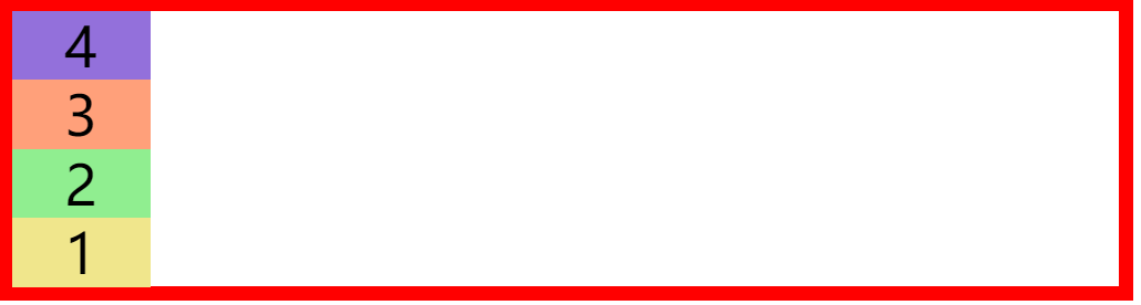
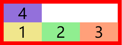
order设置弹性元素的排序顺序
- 如果只设置一个元素的
order设置的元素排到最后
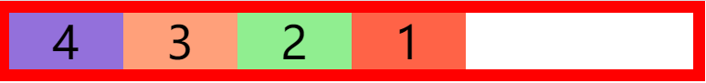
.box1{
            background-color:tomato;
            order: 4;
        }
        .box2{
            background-color: lightgreen;
            order: 3;
        }
        .box3{
            background-color: lightsalmon;
            order: 2;
        }
        .box4{
        background-color:mediumpurple;
        order: 1;
        }
align-self 用来覆盖当前弹性元素上的align-items
align-self: stretch;
练习
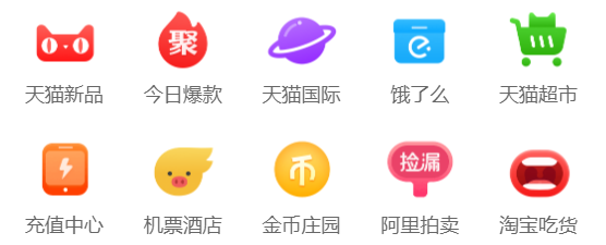
仿淘宝分类
<!DOCTYPE html>
<html lang="en">
<head>
    <meta charset="UTF-8">
    <meta name="viewport" content="width=device-width, initial-scale=1.0">
    <title>Document</title>
    <link rel="stylesheet" href="../static/css/reset.css">
    <style>
        body{
            background-color: rgb(244, 244, 244);
        }

        .box1{
            background-color: white;
            width: 100%;

        }

        ul{
            display: flex;
            justify-content: space-around;

        }

        li{
            width: 15%;
            /* background-color: turquoise; */
        }

        li img{
            width: 100%;
        }

        li a{
            text-align: center;
            display: inline-block;
            text-decoration: none;
        }

        li a span{
            display: block;
            margin-top: 10px;
            color: rgb(102, 102, 102);;
            font-size: 11px;
        }

    </style>

</head>
<body>
    <div class="box1">
    <ul>
        <li>
            <a href="#">
                <img src="../static/img/tb/1.png" alt="">
                <span>天猫新品</span>
            </a>
        </li>
        <li>
            <a href="#">
                <img src="../static/img/tb/2.png" alt="">
                <span>今日爆款</span>
            </a>
        </li>
        <li>
            <a href="#">
                <img src="../static/img/tb/3.png" alt="">
                <span>天猫国际</span>
            </a>
        </li>
        <li>
            <a href="#">
                <img src="../static/img/tb/4.png" alt="">
                <span>饿了吗</span>
            </a>
        </li>
        <li>
            <a href="#">
                <img src="../static/img/tb/5.png" alt="">
                <span>天猫超市</span>
            </a>
        </li>
    </ul>

    <ul>
        <li>
            <a href="#">
                <img src="../static/img/tb/6.png" alt="">
                <span>充值中心</span>
            </a>
        </li>
        <li>
            <a href="#">
                <img src="../static/img/tb/7.png" alt="">
                <span>机票酒店</span>
            </a>
        </li>
        <li>
            <a href="#">
                <img src="../static/img/tb/8.png" alt="">
                <span>金币庄园</span>
            </a>
        </li>
        <li>
            <a href="#">
                <img src="../static/img/tb/9.png" alt="">
                <span>阿里拍卖</span>
            </a>
        </li>
        <li>
            <a href="#">
                <img src="../static/img/tb/10.png" alt="">
                <span>淘宝吃货</span>
            </a>
        </li>
    </ul>
</div>
</body>
</html>
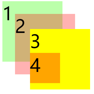
定位
定位(position)
- 定位是一种更加高级的布局手段
- 通过定位可以将元素摆放到页面的任意位置
- 使用position属性来设置定位
可选值:
static 默认值,元素是静止的没有开启定位
relative 开启元素的相对定位
absolute 开启元素的绝对定位
fixed 开启元素的固定定位
sticky 开启元素的粘滞定位
相对定位
相对定位:
- 当元素的position属性值设置为relative时则开启了元素的相对定位
- 相对定位的特点:
1.元素开启相对定位以后,如果不设置偏移量元素不会发生任何的变化
2.相对定位是参照于元素在文档流中的位置进行定位的
3.相对定位会提升元素的层级
4.相对定位不会使元素脱离文档流
5.相对定位不会改变元素的性质块还是块,行内还是行内- 偏移量(offset)
- 当元素开启了定位以后,可以通过偏移量来设置元素的位置
top- 定位元素和定位位置上边的距离
bottom- 定位元素和定位位置下边的距离
- 定位元素垂直方向的位置由top和bottom两个属性来控制
通常情况下我们只会使用其中一- top值越大,定位元素越向下移动
- bottom值越大,定位元素越向上移动
left - 定位元素和定位位置的左侧距离
right - 定位元素和定位位置的右侧距离
- 定位元素水平方向的位置由left和right两个属性控制
通常情况下只会使用一个 - left越大元素越靠右
- right越大元素越靠左
- 定位元素垂直方向的位置由top和bottom两个属性来控制
- 定位元素和定位位置下边的距离
- 定位元素和定位位置上边的距离
 .box1{
            height: 200px;
            width: 200px;
            background-color: springgreen;
        }

        .box2{
            height: 200px;
            width: 200px;
            background-color:steelblue;
            position: relative;
            left: 200px;
            top: -200px;
        }
        .box3{
            height: 200px;
            width: 200px;
            background-color:tan;
        }
 <div class="box1"></div>
    <div class="box2"></div>
    <div class="box3"></div>
绝对定位
-
当元素的position属性值设置为absolute时,则开启了元素的绝对定位
- 绝对定位的特点:
1.开启绝对定位后,如果不设置偏移量元素的位置不会发生变化
2.开启绝对定位后,元素会从文档流中脱离
3.绝对定位会改变元素的性质,行内变成块,块的宽高被内容撑开
4.绝对定位会使元素提升一个层级
5.绝对定位元素是相对于其包含块进行定位的
包含块( containing block ) - 正常情况下: 包含块就是离当前元素最近的祖先**块元素** 绝对定位的包含块: 包含块就是**离它最近**的**开启了定位**的**祖先元素**, **如果所有的祖先元素都没有开启定位则根元素就是它的包含块**- html(根元素、初始包含块)
- 绝对定位的特点:
<div class="box1">1</div>

    <div class="box4">
        4
        <div class="box5">
            5
            <div class="box2">2</div>
        </div>
    </div>
    <div class="box3">3</div>
body{
            font-size: 60px;
        }
        .box1{
            width: 200px;
            height: 200px;
            background-color: #bfa;
        }

        .box2{
            width: 200px;
            height: 200px;
            background-color: orange;
            position: absolute;
            /* left: 0;
            top: 0; */
            bottom: 0;
            right: 0;
        }

        .box3{
            width: 200px;
            height: 200px;
            background-color: yellow;

        }

        .box4{
            width: 400px;
            height: 400px;
            background-color: tomato;
            position: relative;
        }

        .box5{
            width: 300px;
            height: 300px;
            background-color: aliceblue;
            /* position: relative; */
        }
绝对定位的布局
- 水平布局
- 布局公式left + margin-left + border-left + padding-left + width + padding-right + border-right + margin-right + right = 包含块的内容区的宽度
-
当我们开启了绝对定位后:
水平方向的布局等式就需要添加left 和 right 两个值
此时规则和之前一样只是多添加了两个值:
当发生过度约束(即上面等式不成立):
如果9个值中没有 auto 则自动调整right值以使等式满足
如果有auto,则自动调整auto的值以使等式满足,如果都是aotu调整顺序:宽高>偏移量>外边距- 可设置auto的值 margin width left right - 因为**left 和 right的值默认是auto**,所以如果不指定left和right则等式不满足时,会自动调整这两个值垂直方向布局的等式的也必须要满足
top + margin-top/bottom + padding-top/bottom + border-top/bottom + height = 包含块的高度
<div class="box1">
    <div class="box2"></div>
</div>
.box1{
            width: 500px;
            height: 500px;
            background-color: #bfa;

            position: relative;
        }

        .box2{
            width: 100px;
            height: 100px;
            background-color: orange;
            position: absolute;
            margin: auto;
            left: 0;
             right: 0;

             top: 0;
             bottom: 0;
        }
固定定位
固定定位:
- 将元素的position属性设置为fixed则开启了元素的固定定位
- 固定定位也是一种绝对定位,所以固定定位的大部分特点都和绝对定位一样
唯一不同的是固定定位永远参照于浏览器的视口进行定位
固定定位的元素不会随网页的滚动条滚动
<div class="box1">1</div>

    <div class="box4">
        4
        <div class="box5">
            5
            <div class="box2">2</div>

        </div>
    </div>

    <div class="box3">3</div>
body{
            font-size: 60px;
            height: 2000px;
        }
        .box1{
            width: 200px;
            height: 200px;
            background-color: #bfa;
        }

        .box2{
            width: 200px;
            height: 200px;
            background-color: orange;
            position: fixed;
            left: 0;
            top: 0;


        }

        .box3{
            width: 200px;
            height: 200px;
            background-color: yellow;

        }

        .box4{
            width: 400px;
            height: 400px;
            background-color: tomato;

        }
        .box5{
            width: 300px;
            height: 300px;
            background-color: aliceblue;
        }
粘滞定位
粘滞定位
- 当元素的position属性设置为sticky时则开启了元素的粘滞定位一致,不同的是粘滞定位可以在元素到达某个位置时将其固定
- 不推荐使用,兼容性不高
<!-- 创建导航条的结构 -->
    <ul class="nav">
        <li>
            <a href="#">HTML/CSS</a>
        </li>
        <li>
            <a href="#">Browser Side</a>
        </li>
        <li>
            <a href="#">Server Side</a>
        </li>
        <li>
            <a href="#">Programming</a>
        </li>
        <li>
            <a href="#">XML</a>
        </li>
        <li>
            <a href="#">Web Building</a>
        </li>
        <li>
            <a href="#">Reference</a>
        </li>
    </ul>
body{
            height: 3000px;
        }

        .nav{
            width: 1210px;
            height: 48px;
            background-color: #E8E7E3;
            margin:100px auto;
             position: sticky;
             top: 10px;

        }

        /* 设置nav中li */
        .nav li{
            float: left;
            line-height: 48px;

        }

        /* 设置a的样式 */
        .nav a{
            display: block;
            text-decoration: none;
            color: #777777;
            font-size: 18px;
            padding: 0 39px;
        }

        .nav li:last-child a{
            padding: 0 42px 0 41px;
        }

        /* 设置鼠标移入的效果 */
        .nav a:hover{
            background-color: #3F3F3F;
            color: #E8E7E3;
        }
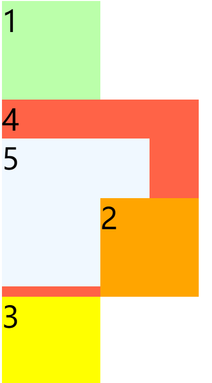
元素的层级
对于开启了定位的元素,可以通过z-index属性来指定元素的层级, z-index需要一个整数作为参数,值越大元素的层级越高元素的层级越高越优先显示如果元素的层级一样,则优先显示靠下的元素祖先的元素的层级再高也不会盖住后代元素。
<div class="box1">1</div>
    <div class="box2">2</div>
    <div class="box3">3
        <div class="box4">4</div>
    </div>
body{
            font-size: 60px;
        }
        .box1{
            width: 200px;
            height: 200px;
            background-color: #bfa;
            position: absolute;
                /* z-index: 3; */
        }

        .box2{
            width: 200px;
            height: 200px;
            background-color: rgba(255 , 0, 0, .3);
            position: absolute;
            top: 50px;
            left: 50px;
            /* z-index: 3; */

        }

        .box3{
            width: 200px;
            height: 200px;
            background-color: yellow;
            position: absolute;
            top: 100px;
            left: 100px;
            z-index: 3;

        }

        .box4{
            width: 100px;
            height: 100px;
            background-color: orange;
            position: absolute;
        }
练习
仿京东
字体与文字
文字字体
字体相关的样式
color 用来设置字体颜色
                font-size 字体的大小
                    和font-size相关的单位
                    em 相当于当前元素的一个font-size
                    rem 相对于根元素的一个font-size
                font-family 字体族(字体的格式)
                    可选值:
                        serif  衬线字体
                        sans-serif 非衬线字体
                        monospace 等宽字体
                        - 指定字体的类别,浏览器会自动使用该类别下的字体

            - font-family 可以同时指定多个字体,多个字体间使用,隔开
                字体生效时优先使用第一个,第一个无法使用则使用第二个 以此类推
font-family: 'Courier New', Courier, monospace;
使用网络字体
font-face可以将服务器中的字体直接提供给用户去使用
问题:
1.加载速度
2.版权
3.字体格式
@font-face {
                /* 指定字体的名字 */
            font-family:'myfont' ;
            /* 服务器中字体的路径 */
            src: url('./font/ZCOOLKuaiLe-Regular.ttf') format("truetype");
        }
图标字体
图标字体(iconfont)
- 在网页中经常需要使用一些图标,可以通过图片来引入图标
但是图片大小本身比较大,并且非常的不灵活 - 所以在使用图标时,我们还可以将图标直接设置为字体,
然后通过font-face的形式来对字体进行引入 - 这样我们就可以通过使用字体的形式来使用图标
fontawesome 使用步骤
1.下载 https://fontawesome.com/
        2.解压
        3.将css和webfonts移动到项目中
        4.将all.css引入到网页中
        5.使用图标字体
        - 直接通过类名来使用图标字体
            class="fas fa-bell"
            class="fab fa-accessible-icon"
- 通过实体来使用图标字体:
&#x+图标的编码;
<i class="fas fa-camera"></i>
<span class="fas"></span>
<link rel="stylesheet" href="./fa/css/all.css">

阿里图标库 使用步骤
使用帮助:https://www.iconfont.cn/help/detail?spm=a313x.7781069.1998910419.d8cf4382a&helptype=code
<html lang="en">
<head>
<meta charset="UTF-8">
<meta name="viewport" content="width=device-width, initial-scale=1.0">
<title>Document</title>
<style>
@font-face {
font-family: 'iconfont'; /* project id 1794617 */
src: url('//at.alicdn.com/t/font_1794617_m4rwwizrot.eot');
src: url('//at.alicdn.com/t/font_1794617_m4rwwizrot.eot?#iefix') format('embedded-opentype'),
url('//at.alicdn.com/t/font_1794617_m4rwwizrot.woff2') format('woff2'),
url('//at.alicdn.com/t/font_1794617_m4rwwizrot.woff') format('woff'),
url('//at.alicdn.com/t/font_1794617_m4rwwizrot.ttf') format('truetype'),
url('//at.alicdn.com/t/font_1794617_m4rwwizrot.svg#iconfont') format('svg');
}
.iconfont{
font-family:"iconfont" !important;
font-size:16px;font-style:normal;
-webkit-font-smoothing: antialiased;
-webkit-text-stroke-width: 0.2px;
-moz-osx-font-smoothing: grayscale;}
</style>
</head>
<body>
<i class="iconfont"></i>
<i class="iconfont"></i>
</body>
</html>

图标字体库
- font awesome:https://fontawesome.com/
- 阿里巴巴矢量图标库:https://www.iconfont.cn/
行高
行高(line height)
- 行高指的是文字占有的实际高度
- 通过
line-height来设置行高- 行高可以直接指定一个大小(px em),也可以直接为行高设置一个整数
- 可以通过line-h - 如果是一个整数的话,行高将会是字体大小的指定的倍数
- 行高经常还用来设置文字的行间距
行间距 = 行高 - 字体大小
字体框
                - 字体框就是字体存在的格子,设置font-size实际上就是在设置字体框的高度
行高会在字体框的上下平均分配
可以将行高设置为和高度一样的值,使单行文字在一个元素中垂直居中 line-height: 200px;
div{
height: 100px;
border: 1px red solid;
line-height: 100px;
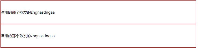
}
 <div class="box1">漳卅的那个散发的zhgnasdngaa</div>
    <div class="box1">漳卅的那个散发的zhgnasdngaa</div>
字体简写属性
如果使用简写属性,除设置的属性外所有字体属性均重置为默认值
div{
            border: 1px red solid;
            /*
                font 可以设置字体相关的所有属性
                    语法:
                        font: 字体大小/行高 字体族
                        行高 可以省略不写 如果不写使用默认值

            */

            /* font-size: 50px;
            font-family: 'Times New Roman', Times, serif; */
            font-weight: bold;
            /* font: 50px/2  微软雅黑, 'Times New Roman', Times, serif; */
            /* font: normal normal 50px/2  微软雅黑, 'Times New Roman', Times, serif; */
            font: bold italic 50px/2  微软雅黑, 'Times New Roman', Times, serif;
            /* font:50px 'Times New Roman', Times, serif;
            line-height: 2; */

            /* font-size: 50px; */
        }
文字常用属性
font-weight自重
- normal 默认值 不加粗
- bold 加粗
- 100-900 九个级别(没什么用)
font-weight: bold;
font-style 字体风格
- normal 正常的
- italic 斜体
font-style: italic;
text-align 文本对齐方式
- left 左侧对齐
- right 右对齐
- center 居中对齐
- justify 两端对齐
text-align: justify;
vertical-align 元素垂直对齐方式
- baseline 默认值 基线对齐
- top 顶部对齐
- bottom 底部对齐
- middle 居中对齐
vertical-align:baseline;
text-decoration 设置文本修饰
- none 什么都没有
- underline 下划线
- line-through 删除线
- overline 上划线
text-decoration: overline;
white-space 设置网页如何处理空白
- normal 正常
- nowrap 不换行
- pre 保留空白
white-space: nowrap;
overflow 设置父元素如何处理溢出的子元素
- visible,默认值 子元素会从父元素中溢出,在父元素外部的位置显示
- hidden 溢出内容将会被裁剪不会显示
- scroll 生成两个滚动条,通过滚动条来查看完整的内容
- auto 根据需要生成滚动条
overflow: hidden;
text-overflow 属性规定当文本溢出包含元素时发生的事情。
- clip 修剪文本。
- ellipsis 显示省略符号来代表被修剪的文本
- string 使用给定的字符串来代表被修剪的文本
text-overflow: ellipsis;
文字常用效果
文字超过父元素大小时自动省略
 div{
            width: 200px;
            white-space: nowrap;
            overflow: hidden;
            text-overflow: ellipsis;
        }
<div>
        Lorem ipsum dolor sit amet consectetur adipisicing elit. Hic minima, animi quos suscipit voluptas provident rerum architecto! Impedit ducimus sequi dolor sunt, incidunt, eveniet fuga, quae magnam illo minima vel.
    </div>

练习
仿京东导航条

<!DOCTYPE html>
<html lang="en">

<head>
    <meta charset="UTF-8">
    <meta name="viewport" content="width=device-width, initial-scale=1.0">
    <title>Document</title>
    <link rel="stylesheet" href="../static/css/reset.css">
    <link rel="stylesheet" href="http://at.alicdn.com/t/font_1794918_0yneh7evb91.css">

    <style>
        .content {
            width: 100%;
            height: 30px;
            background-color: #e3e4e5;
        }

        .bar {
            width: 990px;
            margin: 0 auto;
            background-color: turquoise;
        }

        .location{
            float: left;
            line-height: 30px;

        }
        .location a {
            text-decoration: none;
        }

        .location:hover .map{
            display: block;
        }

        .location span {
            color: #999;
        }

        .location i {
            color: #f10215;
        }

        .map{
            width: 320px;
            height: 436px;
            background-color:#fff;
            position:absolute;
            display: none;
            border: 1px solid #999;

        }

        .listp{
            float: right;
        }

        .list li{
            float: left;
            color: #666;
            font-size: 14px;
            line-height: 30px;
            margin-right: 8px;
        }

       .slipt::after{
           content: '|';
       }


    </style>
</head>

<body>
    <div class="content">
        <div class="bar">
            <div class="location">
                <a href="javascript:;"><i class="iconfont icon-icon-test"></i><span>山东</span></a>
                <div class="map"></div>
            </div>
            <div class="listp">
                <ul class="list">
                    <li>你好,请登录</li>
                    <li>免费注册</li><li class="slipt"></li>
                    <li>我的订单</li><li class="slipt"></li>
                    <li>我的京东</li><li class="slipt"></li>
                    <li>京东会员</li><li class="slipt"></li>
                    <li>企业采购</li><li class="slipt"></li>
                    <li>客户服务</li><li class="slipt"></li>
                    <li>网站导航</li><li class="slipt"></li>
                    <li>手机京东</li>
                </ul>
            </div>
        </div>

    </div>
</body>

</html>
背景
background-color 设置背景颜色
颜色值设置参考 Ctrl+单击我
background-color: #bfa;
background-image 设置背景图片
- 可以同时设置背景图片和背景颜色,这样背景颜色将会成为图片的背景色
- 如果背景的图片小于元素,则背景图片会自动在元素中平铺将元素铺满
- 如果背景的图片大于元素,将会一个部分背景无法完全显示
- 如果背景图片和元素一样大,则会直接正常显示
background-image: url("./img/1.png");
background-repeat 设置背景的重复方式
- repeat 默认值 , 背景会沿着x轴 y轴双方向重复
- repeat-x 沿着x轴方向重复
- repeat-y 沿着y轴方向重复
- no-repeat 背景图片不重复
background-repeat: no-repeat;
background-position 用来设置背景图片的位置
- 通过 top left right bottom center 几个表示方位的词来设置背景图片的位置 使用方位词时必须要同时指定两个值,如果只写一个则第二个默认就是center
- 通过偏移量来指定背景图片的位置:水平方向的偏移量 垂直方向变量
- 原点从内边距开始计算
background-position: center;
background-position: -50px 300px;
设置居中
.box2{
            height: 200px;
            width: 200px;
            background-image: url(../static/img/8bcaa0f267965535.jpg!cc_100x100.webp);
            border: steelblue 1px solid;
            background-repeat: no-repeat;
            background-position: center;
        }
<div class="box2"></div>
雪碧图CSS-Sprite
如果我们的背景图片需要切换(或者是不同的动作切换不同的图片),可以将多个小图片放到一张大图中,通过调整background-position属性来显示不同的位置,这样图片加载到网页中,就可以避免闪烁,也可以节省流量,降低请求数量,这个技术在网页应用中十分广泛,这种图我们称为雪碧图。
使用步骤:
- 确定要使用的图标
- 测量图标的大小
- 根据测量结果创建元素
- 将雪碧图设置为元素的背景图片
- 设置background-position属性偏移量以显示正确的图片
.box{
            width: 36px;
            height: 42px;
            background-image: url(../static/img/23f3ddf914b1b527d0429a3d713cfe3a.png);
            background-position: 0px -193px;
        }

        .box:hover{
            background-position: -41px -193px;
        }

        .box:active{
            background-position: -83px -193px;
        }
<div class="box"></div>
设置背景的范围
background-clip 设置背景的边界
- border-box 默认值,背景会出现在边框的下边
- padding-box 背景不会出现在边框,只出现在内容区和内边距
- content-box 背景只会出现在内容区
background-clip: content-box;
background-origin 背景图片的偏移量计算的原点
- padding-box 默认值,background-position从内边距处开始计算
- content-box 背景图片的偏移量从内容区处计算
- border-box 背景图片的偏移量从边框处开始计算
background-origin: border-box;
background-origin: 0,0;
background-size 设置背景图片的大小
第一个值表示宽度
第二个值表示高度
- 如果只写一个,则第二个值默认是 auto
cover图片的比例不变,将元素铺满contain图片比例不变,将图片在元素中完整显示
background-size: contain;
background-attachment背景图片是否跟随元素移动
- scroll 默认值 背景图片会跟随元素移动
- fixed 背景会固定在页面中,不会随元素移动
background-attachment: fixed;
渐变
通过渐变可以设置一些复杂的背景颜色,可以实现从一个颜色向其他颜色过渡的效果 !!渐变是图片,需要通过
background-image来设置
线性渐变
线性渐变,颜色沿着一条直线发生变化
linear-gradient(red,yellow)红色在开头,黄色在结尾,中间是过渡区域- 线性渐变的开头,可以指定一个渐变的方向
- to left
- to right
- to bottom
- to top
- deg deg表示度数
- turn 表示圈
- 渐变可以同时指定多个颜色,多个颜色默认情况下平均分布,也可以手动指定渐变的分布情况
repeating-linear-gradient()可以平铺的线性渐变
效果1
background-image: linear-gradient(red,yellow,#bfa,orange);
效果2
background-image: linear-gradient(red 50px,yellow 100px, green 120px, orange 200px);
效果3
background-image: repeating-linear-gradient(to right ,red, yellow 50px);
径向渐变
radial-gradient() 径向渐变(放射性的效果)
默认情况下径向渐变的形状根据元素的形状来计算的
正方形 --> 圆形
长方形 --> 椭圆形
- 我们也可以手动指定径向渐变的大小
- 也可以指定渐变的位置
- 语法:radial-gradient(大小 at 位置, 颜色 位置 ,颜色 位置 ,颜色 位置)
circle圆形ellipse椭圆closest-side近边closest-corner近角farthest-side远边farthest-corner远角
- 位置:
toprightleftcenterbottom
background-image: radial-gradient(farthest-corner at 100px 100px, red , #bfa)
练习
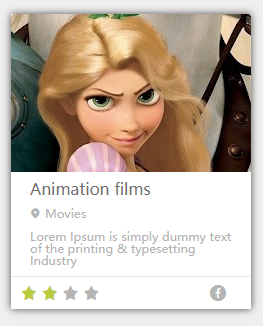
雪碧图
电影卡片练习
表格
在现实生活中,我们经常需要使用表格来表示一些格式化数据:
课程表、人名单、成绩单....同样在网页中我们也需要使用表格,我们通过table标签来创建一个表格
在table中使用tr表示表格中的一行,有几个tr就有几行
在tr中使用td表示一个单元格,有几个td就有几个单元格
rowspan纵向的合并单元格colspan横向的合并单元格
<table border="1" width='50%' align="center">
        <tr>
            <td>A1</td>
            <td>B1</td>
            <td>C1</td>
            <td>D1</td>
        </tr>
        <tr>
            <td>A2</td>
            <td>B2</td>
            <td>C2</td>
            <td rowspan="2">D2</td>
        </tr>
        <tr>
            <td>A3</td>
            <td>B3</td>
            <td>C3</td>
        </tr>
        <tr>
            <td>A4</td>
            <td>B4</td>
            <td colspan="2">C4</td>
        </tr>
    </table>
语义化表格
可以将一个表格分成三个部分:
            * 头部 thead
            * 主体 tbody
            * 底部 tfoot
th 表示头部的单元格
<table border="1" width='50%' align="center">
        <thead>
            <tr>
                <th>日期</th>
                <th>收入</th>
                <th>支出</th>
                <th>合计</th>
            </tr>
        </thead>
        <tbody>
            <tr>
                <td>2000.1.1</td>
                <td>500</td>
                <td>200</td>
                <td>300</td>
            </tr>
            <tr>
                <td>2000.1.1</td>
                <td>500</td>
                <td>200</td>
                <td>300</td>
            </tr>
            <tr>
                <td>2000.1.1</td>
                <td>500</td>
                <td>200</td>
                <td>300</td>
            </tr>
            <tr>
                <td>2000.1.1</td>
                <td>500</td>
                <td>200</td>
                <td>300</td>
            </tr>
        </tbody>
        <tfoot>
            <tr>
                <td></td>
                <td></td>
                <td>合计</td>
                <td>300</td>
            </tr>
        </tfoot>
    </table>
表格的样式
- border-spacing: 指定边框之间的距离
- border-collapse: collapse; 设置边框的合并
默认情况下元素在td中是垂直居中的 可以通过 vertical-align 来修改
vertical-align:middle;
text-align: center;
如果表格中没有使用tbody而是直接使用tr,
那么浏览器会自动创建一个tbody,并且将tr全都放到tbody中
tr不是table的子元素
表单
- 在现实生活中表单用于提交数据
- 在网页中也可以使用表单,网页中的表单用于将本地的数据提交给远程的服务器
- 使用form标签来创建一个表单
文本框
文本框
注意:数据要提交到服务器中,必须要为元素指定一个name属性值
文本框 <input type="text" name="username">
        <br><br>
密码框
密码框 <input type="password" name="password">
单选按钮
像这种选择框,必须要指定一个value属性,value属性最终会作为用户的填写的值传递给服务器
- checked 可以将单选按钮设置为默认选中
单选按钮 <input type="radio" name="hello" value="a">
        <input type="radio" name="hello" value="b" checked>
多选框
多选框 <input type="checkbox" name="test" value="1">
        <input type="checkbox" name="test" value="2">
        <input type="checkbox" name="test" value="3" checked>
下拉列表
<select name="haha">
            <option value="i">选项一</option>
            <option selected value="ii">选项二</option>
            <option value="iii">选项三</option>
        </select>
提交按钮
<input type="submit" value="注册">
常用属性
autocomplete="off"关闭自动补全readonly将表单项设置为只读,数据会提交disabled将表单项设置为禁用,数据不会提交autofocus设置表单项自动获取焦点
大练习
仿小米商城第一屏

动画
过渡效果 transition
MDN:https://developer.mozilla.org/zh-CN/docs/Web/CSS/transition
简单示例
- 通过过渡可以指定一个属性发生变化时的切换方式
- 通过过渡可以创建一些非常好的效果,提升用户的体验
.box{
            height: 200px;
            width: 200px;
            background-color: lightblue;
            transition: width 1s;
        }

        .box:hover{
            width: 150px;
        }
<div class="box"></div>
transition-property: 指定要执行过渡的属性
- 多个属性间使用,隔开
- 如果所有属性都需要过渡,则使用all关键字
- 大部分属性都支持过渡效果,注意过渡时必须是从一个有效数值向另外一个有效数值进行过渡(例如从0到1)
transition-property: height , width;
transition-property: all;
transition-duration: 指定过渡效果的持续时间
- 时间单位:s 和 ms 1s = 1000ms
transition-duration: 2s;
为每个属性分别设置持续时间
transition-duration: 100ms, 2s;
transition-timing-function:设置过渡过程的加速曲线
-
ease 默认值,慢速开始,先加速,再减速
transition-timing-function: ease;

- linear 匀速运动
transition-timing-function: linear;

- ease-in 加速运动
transition-timing-function: ease-in;

- ease-out 减速运动
transition-timing-function: ease-out;

- ease-in-out 先加速 后减速
transition-timing-function: ease-in-out;

- cubic-bezier() 来指定时序函数 参考网站 https://cubic-bezier.com

transition-timing-function: cubic-bezier(.17,.67,.29,-0.82);
- steps() 分步执行过渡效果,分几步执行完毕
可以设置一个第二个值:
end , 在时间结束时执行过渡(默认值)
start , 在时间开始时执行过渡
transition-timing-function: steps(3, end);

transition-delay: 过渡效果的延迟,等待一段时间后在执行过渡
transition-delay: 2s;
简写属性
transition可以同时设置过渡相关的所有属性,只有一个要求,如果要写延迟,则两个时间中第一个是持续时间,第二个是延迟
transition:2s margin-left 1s cubic-bezier(.24,.95,.82,-0.88);
动画 animation
动画和过渡类似,都是可以实现一些动态的效果,不同的是过渡需要在某个属性发生变化时才会触发,动画可以自动触发动态效果
.box{
            height: 5px;
            width: 750px;
            background-color: lightgray;
        }

        .box2{
            height: 5px;
            width: 0px;
            margin-left: 0;
            background-color:lightgreen;
            animation-name: test;
            animation-duration: 3s;
        }

        @keyframes test {
            from{
                width: 0px;
            }
            to{
                width: 750px;
            }
        }
<div class="box">
        <div class="box2"></div>
    </div>

@keyframes关键帧
设置动画效果,必须先要设置一个关键帧,关键帧设置了动画执行每一个步骤
- 使用@keyframes name 为关键帧名称
- from表示动画的开始位置 也可以使用 0%
- to动画的结束位置 也可以使用100%
@keyframes test {
            from{
                margin-left: 0;
                background-color: orange;
            }

            to{
                background-color: red;
                margin-left: 700px;
            }
        }
animation-duration: 动画的执行时间
animation-duration: 4s;
animation-delay动画的延时,等待一段时间后在执行动画
animation-delay: 2s;
animation-timing-function设置过渡过程的加速曲线
animation-timing-function: ease-in-out;
animation-iteration-count 动画执行的次数
infinite无限执行
animation-iteration-count: 1;
animation-direction指定动画运行的方向
normal默认值 从 from 向 to运行 每次都是这样reverse从 to 向 from 运行 每次都是这样alternate从 from 向 to运行 重复执行动画时反向执行alternate-reverse从 to 向 from运行 重复执行动画时反向执行
animation-direction: alternate-reverse;
animation-play-state: 设置动画的执行状态
running默认值 动画执行paused动画暂停
animation-play-state: paused;
animation-fill-mode: 动画的填充模式
none默认值 动画执行完毕元素回到原来位置forwards动画执行完毕元素会停止在动画结束的位置backwards动画延时等待时,元素就会处于开始位置both结合了forwards 和 backwards
animation: test 2s 2 1s alternate;
变形 transform
变形就是指通过CSS来改变元素的形状或位置
变形不会影响到页面的布局
transform用来设置元素的变形效果
平移 translate
translateX() 沿着x轴方向平移
transform: translateX(100px);
平移过渡效果
translateY() 沿着y轴方向平移
transform: translateY(100px);
平移过渡效果
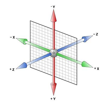
translateZ() 沿着z轴方向平移
z轴平移,调整元素在z轴的位置,正常情况就是调整元素和人眼之间的距离,
距离越大,z轴离人越进。距离约小,元素离人越远z轴平移属于立体效果(近大远小),默认情况下网页是不支持透视,如果需要看见效果
必须要设置网页的视距
html{
            /* 设置当前网页的视距为800px,人眼距离网页的距离 */
            perspective: 800px;
}
transform: translateZ(100px);
平移过渡效果
旋转 rotate
通过旋转可以使元素沿着x y 或 z旋转指定的角度
rotateX()沿着x轴方向平移
transform: rotateX(180deg);
旋转过渡效果
rotateY()沿着y轴方向平移
transform: rotateY(180deg);
旋转过渡效果
rotateZ()沿着z轴方向平移
transform: rotateZ(180deg);
旋转过渡效果

backface-visibility:是否显示元素的背面
backface-visibility: hidden;
效果
缩放 scale
scaleX()水平方向缩放
transform: scaleX(.5);
缩放过渡效果

scaleY()垂直方向缩放
transform: scaleY(.5);
缩放过渡效果
scale双方向缩放
transform: scale(1.5);
缩放过渡效果
设置3d变形效果
transform-style: preserve-3d;
Z轴
练习
表
<!DOCTYPE html>
<html lang="en">
<head>
<meta charset="UTF-8">
<meta name="viewport" content="width=device-width, initial-scale=1.0">
<title>Document</title>
<style>
.box1{
height: 500px;
width: 500px;
background-color: lightsalmon;
margin: 0 auto;
border-radius: 50%;
}
.box2{
height: 500px;
width: 500px;
/* background-color:lightseagreen; */
margin: 0 auto;
animation-name: test;
/* 一次动画执行时间 */
animation-duration: 60s;
/* 动画循环执行 */
animation-iteration-count:infinite;
animation-timing-function: steps(60);
}
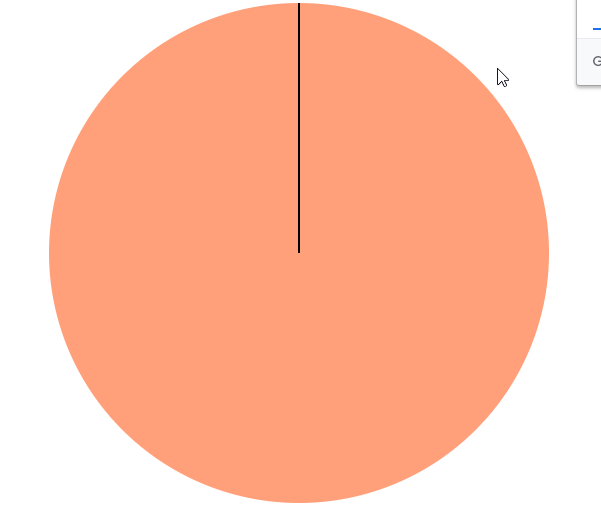
.box3{
height: 250px;
width: 2px;
background-color: black;
margin: 0 auto;
}
@keyframes test{
from{
transform: rotateZ(0deg);
}
to{
transform: rotateZ(360deg);
}
}
</style>
</head>
<body>
<div class="box1">
<div class="box2">
<div class="box3"></div>
</div>
</div>
</body>
</html>
立方体
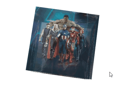
<!DOCTYPE html>
<html lang="en">
<head>
    <meta charset="UTF-8">
    <meta name="viewport" content="width=device-width, initial-scale=1.0">
    <title>Document</title>
    <style>
        html{
            /* 设置视距 */
            perspective: 800px;
        }

        .conetnt{
            width: 200px;
            height: 200px;
            /* background-color: cadetblue; */
            margin: 100px auto;
            /* 设置关键帧名称 */
            animation-name: test;
            /* 设置动画时间 */
            animation-duration: 10s;
            /* 设置动画循环 */
            animation-iteration-count: infinite;
            /* 开启3d样式 */
            transform-style: preserve-3d;
        }

        .conetnt div {
            /* 设置透明度 */
           opacity: 0.7;
           /* 绝对定位 */
           position: absolute;
        }

        @keyframes test {
            from{
                /* x轴平移 y轴平移 */
                transform: rotateX(0deg) rotateZ(0deg);
            }
            to{
                transform: rotateX(360deg) rotateZ(360deg);
            }
        }

        img{
            vertical-align: top;
        }

        .box1{
            /* y轴旋转90 z轴平移100  */
            transform: rotateY(90deg) translateZ(100px);
        }

        .box2{
            transform: rotateY(-90deg) translateZ(100px);
        }
        .box3{
            transform: rotateX(90deg) translateZ(100px);
        }
        .box4{
            transform: rotateX(-90deg) translateZ(100px);
        }
        .box5{
            transform: rotateY(180deg) translateZ(100px);
        }
        .box6{
             transform: rotateY(0deg) translateZ(100px);
        }


    </style>
</head>
<body>
    <div class="conetnt">
        <div class="box1">
            <img src="https://s1.ax1x.com/2020/05/04/YCGsPK.jpg">
        </div>
        <div class="box2">
            <img src="https://s1.ax1x.com/2020/05/04/YCGcxe.jpg">
        </div>
        <div class="box3">
            <img src="https://s1.ax1x.com/2020/05/04/YCGqMQ.jpg">
        </div>
        <div class="box4">
            <img src="https://s1.ax1x.com/2020/05/04/YCGOqs.jpg">
        </div>

        <div class="box5">
            <img src="https://s1.ax1x.com/2020/05/04/YCGvaq.jpg">
        </div>

        <div class="box6">
            <img src="https://s1.ax1x.com/2020/05/04/YCJCzF.jpg">
        </div>

    </div>

</body>
</html>
效果
元素透明效果
opacity: 0.7;
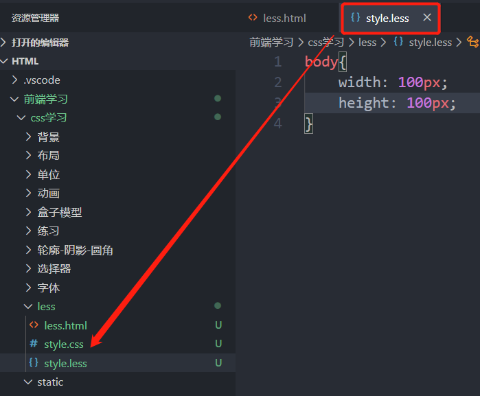
less
less是一门css的预处理语言
- less是一个css的增强版,通过less可以编写更少的代码实现更强大的样式
- 在less中添加了许多的新特性:像对变量的支持、对mixin的支持... ...
- less的语法大体上和css语法一致,但是less中增添了许多对css的扩展,
所以浏览器无法直接执行less代码,要执行必须向将less转换为css,然后再由浏览器执行
原声css对变量的支持
IE支持度不高
声明与使用
--color:#ff0;
background-color: var(--color);
easy less插件
安装插件后再写less代码时会自动生成css代码
层级后代关系
body{
    width: 100px;
    height: 100px;
    div{
        color: red;
        p{
            color: royalblue;
        }
    }
}
注释
//less单行注释
/*
	css多行注释
*/
变量
声明与赋值
//单位变量
@a:100px
@b:#bfa
div{
	width:@a;
	color:@b;
}
选择器
&当前块
body{
    // &:hover = body:hover
    &:hover{
        color: red;
    }
}
body:hover {
  color: red;
}
样式继承
.box1{
    width: 200px;
}
.box2:extend(.box1){
    color: blue;
}
.box1,
.box2 {
  width: 200px;
}
.box2 {
  color: blue;
}
样式复制
.box1{
    width: 200px;
}
.box2{
    .box1();
    color: blue;
}
.box1 {
  width: 200px;
}
.box2 {
  width: 200px;
  color: blue;
}
公共样式,类似函数
.box1(){
    width: 200px;
    color: red;
}
.box2{
    .box1();
}
.box2 {
  width: 200px;
  color: red;
}
混合函数
方法调用,传参
.box1(@h,@w){
    width: @w;
    height: @h;
    color: red;
}
.box2{
     // .box1(100px,200px);
    .box1(@w:200px,@h:100px);
}
.box2 {
  width: 200px;
  height: 100px;
  color: red;
}
移动端
像素
- 屏幕是由一个一个发光的小点构成,这一个个的小点就是像素
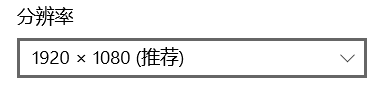
- 分辨率:1920 x 1080 说的就是屏幕中小点的数量,横向1920个像素点,纵向1080个像素点
- 在前端开发中像素要分成两种情况讨论:CSS像素 和 物理像素
- 物理像素,显示器的小点点就属于物理像素
- CSS像素,编写网页时,我们所用像素都是CSS像素
- 浏览器在显示网页时,需要将CSS像素转换为物理像素然后再呈现
- 一个css像素最终由几个物理像素显示,由浏览器决定:
默认情况下在pc端,一个css像素 = 一个物理像素1:1
视口 viewport
- 视口就是屏幕中用来显示网页的区域
-
可以通过查看视口的大小,来观察CSS像素和物理像素的比值
-
默认情况下:
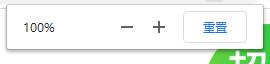
视口宽度 1920px(CSS像素)
1920px(物理像素)- 此时,css像素和物理像素的比是 1:1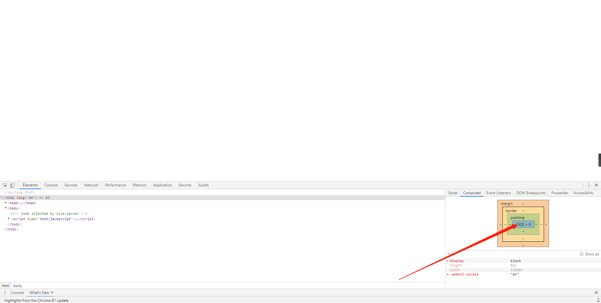
-
浏览器放大两倍的情况:
视口宽度 960px(CSS像素)
1920px(物理像素)
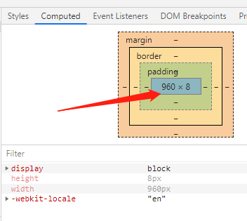
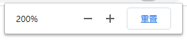
- **此时,css像素和物理像素的比是1:2**即一个浏览器显示一个css像素宽度,物理像素用了两个像素显示(此处忽略高度),`也就是100个css像素经过缩放200%后显示器显示200个像素`。
- 我们可以通过改变视口的大小,来改变CSS像素和物理像素的比值
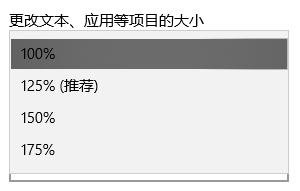
影响视口宽度的因素有
浏览器缩放百分比,系统缩放,拖动浏览器窗口
移动端完美视口
不同屏幕,单位像素的多少是不同的,单位像素越多屏幕会越清晰,
默认情况下,移动端的网页都会将视口设置为 980像素(css像素)。 以确保pc端网页可以在移动端正常访问,但是如果网页的宽度超过了980,移动端的浏览器会 自动对网页缩放以完整显示网页。
所以基本大部分的pc端网站都可以在移动端中正常浏览,但是往往都不会有一个好的体验, 为了解决这个问题,大部分网站都会 专门为移动端设计网页
移动端默认情况下像素比是 980/移动端宽度,即视口宽度(css像素)/移动端物理屏幕宽度
我的手机是小米6,默认情况下像素比是980/1080=0.907
如果我们直接在网页中编写移动端代码,这样在980的视口下,像素比是非常不好,导致网页中的内容非常小
编写移动页面时,必须要确保有一个比较合理的 像素比:
1css像素 对应 2个物理像素
1css像素 对应 3个物理像素
可以通过meta标签来设置视口宽度,控制像素比,如果这样固定视口宽度会导致再不同机型下显示效果不同。
所以 不能将视口宽度写死
<meta name="viewport" content="width=100px">
每一款移动设备设计时,都会有一个最佳的像素比,所以设备不同,像素比不同
一般我们只需要将像素比设置为该值即可得到一个最佳效果
将像素比设置为最佳像素比的视口大小我们称其为完美视口
<meta name="viewport" content="width=device-width">
完美视口问题
不同手机完美视口的大小是不同的。
iphonex 375px
iphone6 414px


如果设置一个元素宽度为375px,再iphonex里显示正常,再iphone6中就不能占满宽度。
由于不同设备视口和像素比不同,所以同样的375个像素在不同的设备下意义是不一样,
为什么不用100%呢?
在多层元素嵌套下,百分比的参照物不同,所以不能用百分比进行布局。
VW单位
vw表示的是视口的宽度(viewport width)
- 100vw = 一个视口的宽度
- 1vw = 1%视口宽度
vw单位永远参考于视口宽度进行计算
常规的设计图宽度750px,使用vw如何通过设计图中的大小来设计网站大小?
设计图中48x 35像素大小的元素如何在页面中保证元素大小?
100vw = 750px (设计图中像素)
0.1333333333333333333vw = 1px
0.13333333333vw x 48px = 6.4vw
0.13333333333vw x 35px = 4.66666666666vw
如果根据设计图像素计算vw , 必须通过0.133333333333*px ,数值的换算非常不方便
VW适配
1rem = 1 html的字体大小
能否将font-size设置为0.1333333333来方便设置vw呢?
font-size: 0.1333333333333333vw;
网页中字体大小最小是12px,不能设置一个比12像素还小的字体
如果我们设置了一个小于12px的字体,则字体自动设置为12
现在将font-size 扩大100倍
font-size: 13.33333333333333vw;
每次使用时设计图像素除100
width: 0.48rem;
height: 0.35rem;
练习
<!DOCTYPE html>
<html lang="en">
<head>
    <meta charset="UTF-8">
    <!-- <meta name="viewport" content="width=device-width, initial-scale=1.0"> -->
    <!-- 禁止缩放 -->
    <meta name="viewport" content="width=device-width, user-scalable=no, initial-scale=1.0, maximum-scale=1.0, minimum-scale=1.0">
    <title>Document</title>
    <link rel="stylesheet" href="../static/css/reset.css">
    <link rel="stylesheet" href="//at.alicdn.com/t/font_1800526_56a16ttb0kw.css">
    <link rel="stylesheet" href="style.css">

</head>
<body>
        <!-- 创建头部容器 -->
        <div class="head">
            <div class="menu"><i class="iconfont icon-menu"></i></div>
            <h1 class="learn">I Learn</h1>
            <div class="search"><i class="iconfont icon-search"></i></div>
        </div>

        <div class="banner">
            <a href="">
                <img src="../static/img/banner.png" alt="">
            </a>
        </div>

        <div class="btn-grop">
            <a href="" class="book">
                <i class="iconfont icon-book"></i>
                我的读书
            </a>
            <a href="" class="star">
                <i class="iconfont icon-star"></i>
                高星教师
            </a>
            <a href="" class="tag">
                <i class="iconfont icon-37tag"></i>
                我的收藏
            </a>
            <a href="" class="down">
                <i class="iconfont icon-down"></i>
                我的下载
            </a>
        </div>

        <div class="list">
            <div class="title">
                <h2>课程</h2>
                <a href="">
                    更多
                    <i class="iconfont icon-add"></i>
                </a>
            </div>
            <div class="items">
                <div class="item">
                    <a href="" class="title-img">
                        <img src="../static/img/cover.png">
                    </a>
                    <a class="title-name">欣赏美丽日出</a>
                    <a href="" class="user-name">
                        <img src="../static/img/avatar.png">
                        <p>
                            Zhao Jishun
                        </p>
                    </a>
                </div>
            </div>

        </div>
</body>
</html>
*{
    margin: 0;
    padding: 0;
}

// 设置设计图宽度
@total-wigth:750;
//设置宽度
@content-width:6.93rem;


a{
    text-decoration: none;
}
html{
    // 设置rem比值
    font-size: 100vw / @total-wigth * 100;
    background-color: #eff0f4;
}

.head{
    display: flex;
    // background-color: skyblue;
    justify-content: space-between;
    height: 1.75rem;
    width: 6.93rem;
    line-height: 1.75rem;
    margin: 0 auto;
    // 辅轴对齐方式
    align-items: center;
    .learn{
        font-size: 0.7rem;
        color: #24253d;
    }

    i{
        color: #656565;
        font-size: 28px;
    }
}

.banner{
    width: 6.93rem;
    // height: 2.27rem;
    margin: 0 auto;
    // background-color: sandybrown;
    img{
        width: 100%;
        background-color: rosybrown;
        border-radius: 15px;
    }
}

.btn-grop{
    width: 6.93rem;
    height: 3.29rem;
    margin: 0 auto;
    display: flex;
    flex-direction: row;
    flex-wrap: wrap;
    justify-content: space-between;
    align-content: space-evenly;


    a{
        color: seashell;
        height: 1.04rem;
        width: 3.27rem;
        font-size: 0.42rem;
        line-height: 1.04rem;
        border-radius: 8px;
        text-align: center;

        i{
            font-size: 0.42rem;
        }
    }
    .book{
        background-color: #f97053;
    }

    .star{
        background-color: #c961ff;
    }

    .tag{
        background-color: #ff3971;
    }

    .down{
        background-color: #1d9bfe;
    }
}

.list{

    height: 4rem;
    margin-bottom: 0.89rem;
    .title{
        height: 0.46rem;
        width: 6.60rem;
        display: flex;
        font-size: 0.39rem;
        justify-content: space-between;
        margin: 0 auto 14px auto;
        padding-left: 14px;
        border-left: 2px solid #3a84ff;
        align-items: center;
        line-height: 0.46rem;
        text-align: center;

        a{
            color: #656565;
        }
    }

    .items{

        // background-color: steelblue;
        padding: 0.3rem;
        display: flex;
        overflow: auto;
        .item{
            flex: none;
            height: 3.03rem;
            width: 2.85rem;
            background-color: #ffffff;
            box-shadow: 0 0 10px rgba(0, 0, 0, .3);
            padding: 0.22rem;
            display: flex;
            flex-direction: column;
            border-radius: 0.2rem;
            justify-content: space-between;
            margin-right: 0.24rem;
            .title-img{
                height: 1.55rem;
                img{
                    width: 100%;
                }
            }

            .title-name{
                font-size: 0.35rem;
                color: #24253d;
            }

            .user-name{
                display: flex;
                align-items: center;

                img{
                    width: 0.42rem;
                    height: 0.42rem;
                    margin-right: 5px;
                    vertical-align: top;
                }
                p{
                    font-size: 0.29rem;
                    color: #969494;
                }
            }
        }

    }

}
响应式布局
网页可以根据不通的设备或窗口大小呈现出不同的效果
使用响应式布局,可以使一个网页适用于所有设备
响应布局的关键就是媒体查询
通过媒体查询,可以为不通的设备,或设备不同状态来分别设置样式
媒体查询
语法:@media 查询规则{}
媒体类型
- all 所有设备
- print 打印设备
screen带屏幕的设备- speech 屏幕阅读器
- 可以使用,连接多个媒体类型,这样它们之间就是一个或的关系
@media only screen {
            body{
                background-color: #bfa;
            }
        }
媒体特性
- width 视口的宽度
- height 视口的高度
- min-width 视口的最小宽度(视口大于指定宽度时生效)
- max-width 视口的最大宽度(视口小于指定宽度时生效)
@media (max-width: 500px){
             body{
                background-color: #bfa;
             }
样式切换的分界点,我们称其为断点,也就是网页的样式会在这个点时发生变化
下面是比较常用的断点
- 小于768 超小屏幕 max-width=768px
- 大于768 小屏幕 min-width=768px
- 大于992 中型屏幕 min-width=992px
- 大于1200 大屏幕 min-width=1200px
@media only screen and (min-width: 500px) and (max-width:700px){
             body{
                background-color: #bfa;
             }
         }